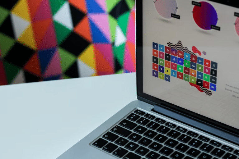
Visual content is so clutch for connecting with your audience these days. As they say, a picture’s worth a thousand words. It’s true – graphics and visuals communicate ideas way more powerfully than text alone.
As a fellow marketer, I feel your pain trying to create kick-butt visual content that actually engages people. There’s a ton that goes into graphic design – it’s both an art and a science!
In this post, I’ll share the strategies and principles I’ve learned for making eye-popping, effective visual content for marketing.
Get to Know Your Audiences
The first step is getting inside your audience’s head. You want to create visuals specifically tailored to their tastes and perspective.
Ask yourself:
- What visual styles do my peeps find appealing and attention-grabbing?
- What colors, fonts, and imagery do they dig most?
- What content and messaging matters to them?
Do some recon to uncover intel about your target audience’s demographics, psychographics, needs, and problems. Surveys, interviews, and focus groups with your customers can provide priceless insights to inform your visual design choices.
Studying what your competitors and industry leaders are doing visually is mad helpful too. See what visual trends and styles are resonating in your space. What are people responding to and engaging with? Business often use website builder such as Squarespace to create stunning sites that draw in their target audience. Reverse engineer what’s working for others. It’s also clutch to map out your customers’ journey with your brand. ID key moments and touchpoints where killer visuals can shape their experience. Know when and where to hit them with graphics that move them along.
The time spent up front understanding your peeps will pay off bigtime in more effective, on-target visuals later.
Master the Graphic Design Fundamentals
Now that you know your audience, let’s get into some graphic design theory to level up your skills.
Learning core design principles will take your visual content from amateur hour to pro-level. Even simple stuff like fonts or colors can massively upgrade your graphics when done intentionally.
Here are the key fundamentals to study up on:
Contrast
Contrast is king when it comes to visual appeal and clarity. You want important elements to stand out from the background.
Use contrasting colors, sizes, imagery, or stylings to create focal points that grab attention. High contrast looks dynamic and bold.
Some examples:
- Pair complementary or opposite colors like blue and orange
- Make a key statistic or text much larger or bolder
- Use an eye-catching photo amidst a neutral background
Also consider contrasting fonts and shapes. For instance, pair a sleek sans-serif header with a thin script font for contrast.
Alignment
Proper alignment makes designs look crisp, polished and orderly. It’s all about having compositional harmony.
Align visual elements along an invisible line or grid to look tight and professional. Guide the viewer’s eye naturally across the image.
Try techniques like:
- Lining up icons, text sections, logos along a consistent horizontal or vertical axis
- Justifying elements to the edges or containers they’re in
- Using the rule of thirds to place items smartly in frame
Hierarchy
Establishing a clear visual hierarchy guides the viewer through the imagery and messaging. Use it to highlight what’s most important.
Typically you want to lead with dominant text or graphical elements to grab attention up front. Then layer in supplemental info and supporting graphics lower in the hierarchy. Think pyramid – heavy focus up top, details below.
Some hierarchy best practices:
- Make key text like headlines much larger or bolder
- Use whitespace strategically to isolate dominant items
- Put important info front-and-center instead of buried
- Use spacing, scale, and weight for clarity on what to notice first, second, etc.
Balance
Distribute visual weight evenly across the composition. If there’s heavy imagery on one side, balance it out with something on the other side.
Tips for nailing balance:
- Spread design elements out instead of clumping things
- Use white space as a design element to fill empty areas
- Make images the same relative size and visual weight
- Place items farther apart if they’re visually heavier
Test and Evolve Your Visuals
Design work is never “done” – it’s an ongoing process of iteration, testing, and refinement.
Routinely get feedback from coworkers, customers, and your community on your visual content experiments. See what people respond positively to and where they get confused or disengaged.
For quantifiable data, set up A/B tests of visual variants. See if a new color scheme, font, layout increases conversions or engagement. Let real data guide your design decisions.
Continually analyze metrics on your visual content performance. If certain posts or images underperform, what can you tweak and test next time?
Allow your design skills and style to gradually evolve as you learn more about your audience. As their needs and preferences change, so should your visual content.


